Patient design system
The patient-facing views in Concentric now look subtly different. As we did for the clinician application in release 67, the patient application and consult view now work to a shared design system, a consistent set of components, layouts, and interaction rules.
This means the application should feel more cohesive, predictable, and consistent across all interactions. While much has changed behind the scenes, our aim has been to make the transition feel effortless for users.
This update also includes several accessibility improvements, including:
- Improved compatibility with screen readers and other assistive technologies
- A new high-contrast mode
- Easier access to an improved print version of the consent information
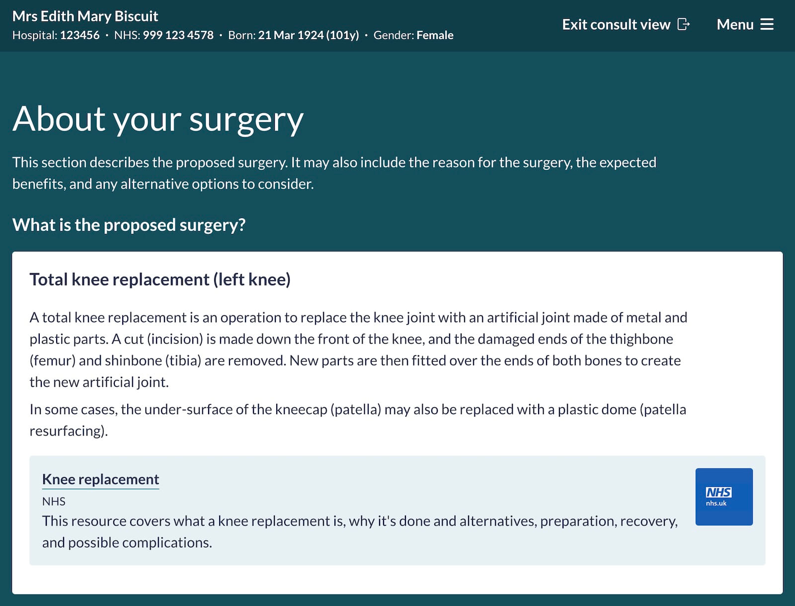
New intro page on patient login
Previously, once a patient logged in, they were taken straight to their consent information. Feedback from patients highlighted that this could feel abrupt, moving immediately into important health information without enough context about what Concentric is or how they were expected to use it.
The new intro page provides:
- Clear reassurance that the information relates to the patient and their care
- An explanation of what Concentric is and how it supports the consent process
- Guidance on how it fits alongside a consent conversation with a clinician
- Clear access to support, printing, and accessibility options
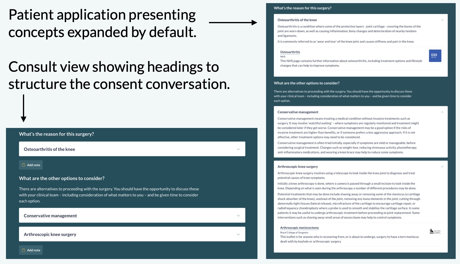
Refinement of information shown by default
The patient application and consult view serve different purposes, and this release better reflects that distinction.
- Consult view supports a consent conversation between the patient and clinician. It aims to provide structure without getting in the way of discussion.
- Patient app is designed for review at the patient’s convenience, away from the clinical environment.
As a result, the two views now show different levels of information by default:
- Consult view continues to show most concepts at the heading level, with details expandable as needed.
- The patient application now presents most concepts expanded by default, supporting deeper independent review without the barrier or annoyance of multiple clicks.
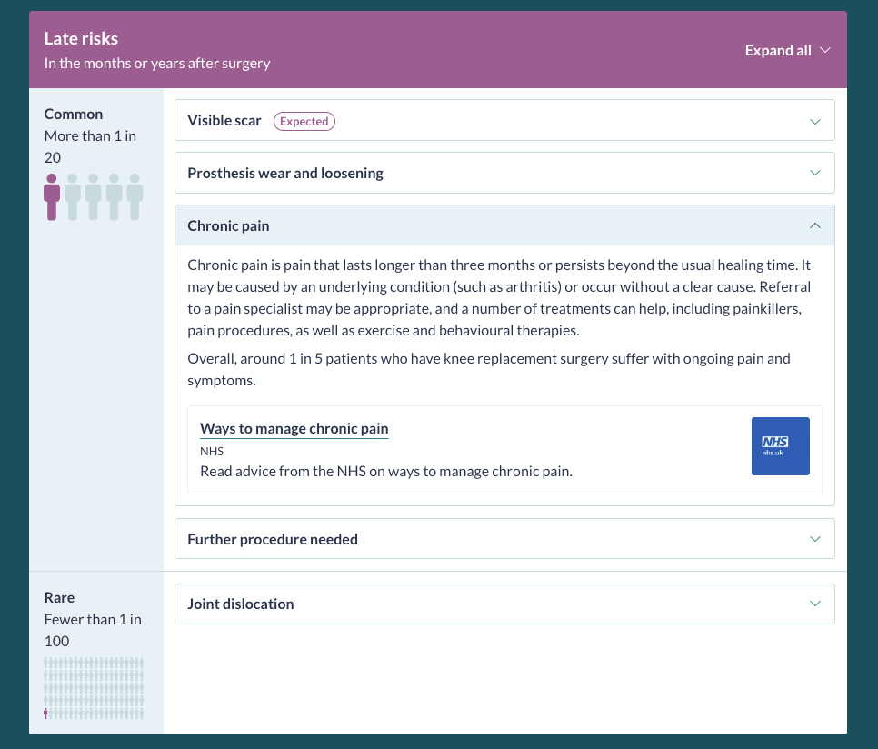
Risk sections
In both views, risk sections now show the top-level category expanded by default, with individual risk descriptions collapsed. This strikes a balance between clarity and cognitive load, ensuring that risk names and structure are visible without overwhelming users with full descriptions immediately.
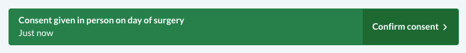
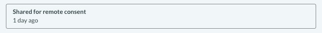
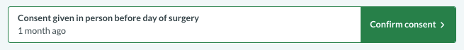
Relative time added to consent status banner
In our clinician view, the episode history already shows a timeline of consent events, aligned with the status banner at the top of the page. How long ago consent was given is operationally important, for example, when determining whether consent needs confirming, and also helps clinicians quickly confirm they are viewing the correct episode, particularly for repeat procedures.
The status banner now shows the relative time since the last consent event. This makes recency clearer at a glance, reduces cognitive load, and helps prevent errors such as using a historic consent episode or missing a same-day confirmation of consent.
Support guide added to account menu
Each organisation’s getting started and support guide has always been shared with new users during account creation. As deployments have matured, these guides have increasingly been used beyond onboarding, including for ongoing support information, updates, and contact details.
The organisation’s getting started and support page is now directly accessible from the account menu, making it easier for users to find help when they need it.